
Thursday, March 31, 2011
Calling all Faeries
Mermaids pt 3

Wednesday, March 30, 2011
Mermaids pt 2

Tuesday, March 29, 2011
The Mermaid Project
I've started work on a series for an accordian book of mermaids. I don't have a specified route to the end. I just plan on using different mediums and different papers and when I have nothing more to say on the subject the book will be done!
 This first work was done on sketchbook paper coated with gesso. The medium for all parts of the mermaid are drawing inks. These inks contain shellac and when applied to the gesso preparation gave a shiny, bright, vibrant look. The back areas of the water were done with watercolor.
The second work below was also done on sketchbook paper, uncoated with only drawing inks. The finish is somewhat flat... need to think how to rectify that. Any suggestions?


The second work below was also done on sketchbook paper, uncoated with only drawing inks. The finish is somewhat flat... need to think how to rectify that. Any suggestions?

Below is the change with some shading using colored pencils.

Sunday, March 27, 2011
Easter Eggs!

#1 - Green Eggs & Ham done with markers, stamps and a cut-out piggie.
#2 - Zenegg done with markers and colored pencils.
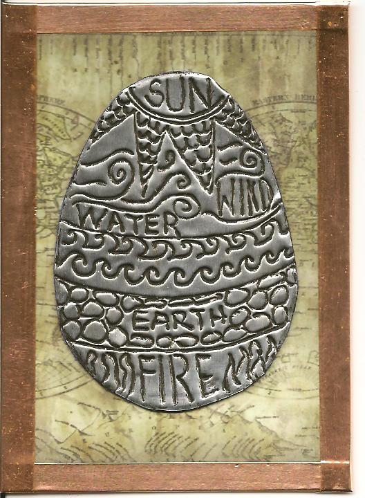
#3 - Earth Egg done with the foil tape described in the previous post. This time I rubbed the black acrylic paint into the crevices and buffed off the extra. The edges are sealed with copper foil tape.
#5 is just a fun little drawing of the easter bunny done in markers and pen.
#6 took some trial and error in it's construction. It is a faberge egg done with gold and silver leaf pen, copper foil and ephemera. The top opens to reveal a pull up hen with a key to the front lock. The front doors open to reveal two lovers.

I hope you all have a wonderful Easter and remember, throw paint... not eggs!
Friday, March 25, 2011
Foiled Again!

Wednesday, March 16, 2011
Thought for the Day
Just a little thought sitting on my desk that needed to be heard today :-)
Have a great day!

Tuesday, March 15, 2011
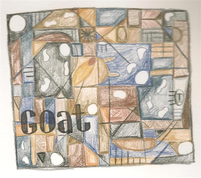
The Cubist Goat You Ever Saw
Okay, one more attempt to try and understand the construction of cubism... this time one of my goats (this one was a baby and her name is Milky Way). This time I added the stencil for Sox! I think the spots mess this one up and maybe I should have done them in straight sided shapes, but you do and learn!


DIY Cubism
I've had a few conversations recently regarding cubism and how it was produced. Exactly how does one go about transforming an object or person into a cubist painting? There are many explanations such as a cube has six sides, 3 of which are visible at any one time, however, you show all 6 sides. I've also read that you paint the spaces "in-between" the objects - whatever that means. Some people are of the opinion that there are no guidelines or methods, you much just "understand" the thinking of the day. I've also read that you turn a 3D object into a 2D object by flatening it. Yet another opinion was that you draw shapes, add to them and then apply the pieces of the object in different perspectives and shades, etc. The last thought I heard was to reduce the object to basic shapes. So, trying to use a little bit of each piece of opinion here is my feeble 15minute attempt to turn something into a cubist drawing. Please hold all laughter until the end :-)
Step One
I started with a picture of the Mona Lisa.

I chose this picture because it has a limited color pallet with darks and lights. It also has some very distinct features (eyes, mouth, pleating, hands).
Step Two
Next I tried to draw the figure in basic shapes with the outstanding features that I wanted to be noticable in the final drawing. I'm not sure that it is proper since some of the master cubist paintings are hard to discern anything at all!

Again, please hold your laughter until the end... I'm just going with a method here!
Step Three
Once I had my basic shapes and attributes I started adding those shapes and other shapes onto the paper. To be honest i tried to think of them as puzzle pieces all dumped out of the box and not yet put together. Then I added complementary shapes and scattered attributes.

......and then I called my therapist.... now you can laugh! Hope it brought a smile to your face today!
Saturday, March 12, 2011
All the Buzz
Yesterday I decided to start with a single piece of paper and then just keep adding pieces and go where ever it took me. I started with a blank 100lb bristol ATC blank and decided to use some new crackle medium I picked up on my rainy day trip to the art store. I base coated with Ultramarine Blue acrylic and then mixed a bit of Indian Turquoise into the crackle medium. I applied a very thin coat which gave a small fine crackle to show the ultramarie through. I then used a grab bag scrap of yellow toned cardstock and cut a hexagon door. This was glued on top of the bristol board. I've had bees on the brain for several weeks now so the hexagon door mimicked the honeycomb shape and I honeycombed my journal page with markers and glued the ATC onto the page. Inside the door I added a Rosetti charm ephremra print that I topped with a bubble epoxy sticker. She became my queen bee in her own private bee hive boudoir. Next I added a few trinkets and fashioned a door with string and brads. Lettering and bee illustration done in markers!


Thursday, March 10, 2011
Here Fishy Fishy!
Another new technique that cost me $150! LOL! I wanted to try layering inks over a papered and glazed card but I didn't like the ink colors I had for this project so off to the art store I went. When entering I picked up a small carry basket because, after all, I only came for ink pads! Well then a big storm came through after I picked up the ink pads so I couldn't go out to the car then...maybe I'll just look around and see if anything inspires me... holy moly... I should have RUN out the front door in the monsoon! Below are the end results and let's see ($150 / 6 cards equals....) uhm each one only cost me $25! lol!


Into the Paint Pot
I was urged by my friends in a yahoo art group to start an art blog. I warned them that I'm really bad at blogging (obviously) but I'd give it another try. So instead of starting a new blog I thought I'd just carry on from this one so saddly neglected (can I claim I was in hibernation all winter?). I will endeavor to post daily (ha, we'll see about that) about my daily art-fart - cuz you know there's gonna be one!
Today's entry is a little painting technique I flipped upon in Bernie Berlin's book "Artist Trading Card Workshop". You first find a magazine image of a face that you'd like to apply the technique to. I chose Natalie Portman's b&w photo in a January Newsweek.
 Once you have applied the image to your intended paper (trading card, journal page, etc), you cover it lightly with a coat of gesso. You can see lying on the table beneath my gessoed Natalie the final look you are going for from Bernie's book.
 Next you define the image with markers and paint her up. The final result is a very cool ghostly looking image that you can funk-i-fy or glamorize or do your own thing to. For my first attempt I stole the blond hairdo on Bernie's example.
 I was a bit heavy handed with the sharpie, but it was a good exercise and I'm ready to try another one with complete Anna-Funk! Keep your eyes open for it!
Today's entry is a little painting technique I flipped upon in Bernie Berlin's book "Artist Trading Card Workshop". You first find a magazine image of a face that you'd like to apply the technique to. I chose Natalie Portman's b&w photo in a January Newsweek.


Subscribe to:
Posts (Atom)